
About “SnackShop”
SnackShop is a Desktop first website that allows users to order their favorite snacks and avoid the long lines.
Project Duration: 1 week
Foundation
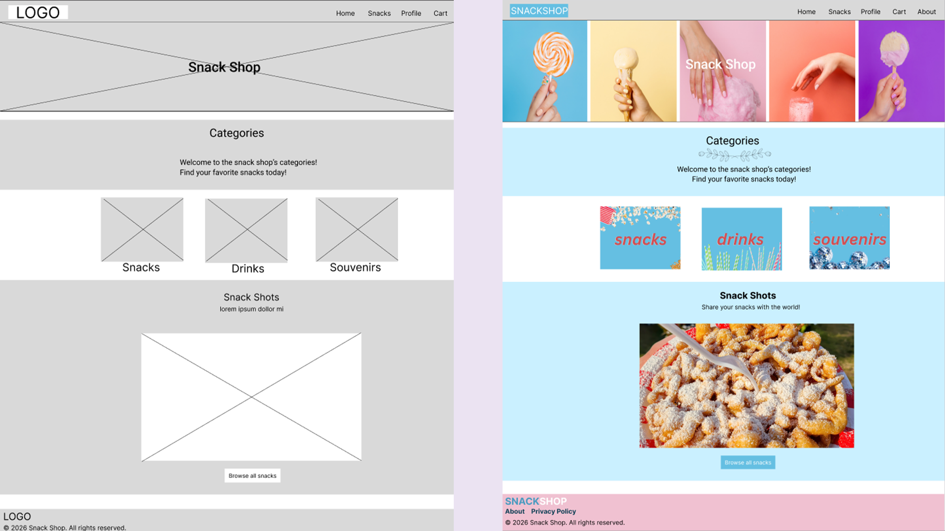 Side by side of both wireframe and mock up of the SnackShop Homepage.
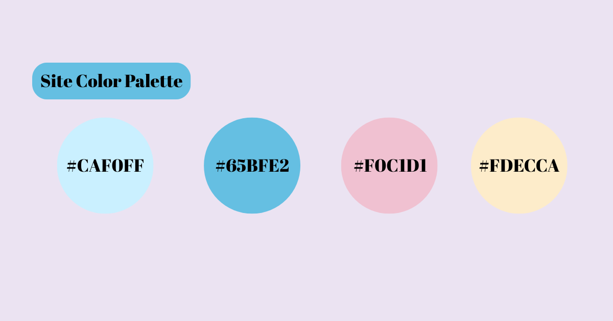 I chose these 4 colors due to being light and fun. When I looked at these colors I instantly thought about theme parks.
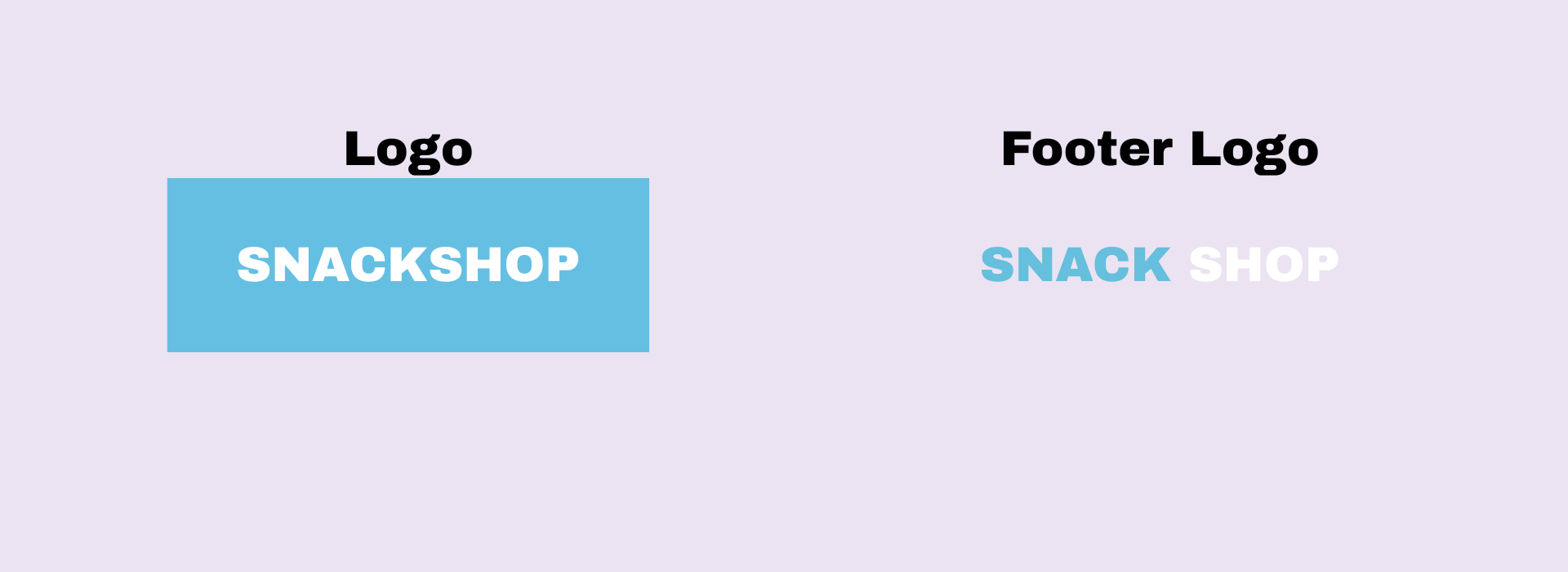
When coming up with a name for SnackShop I wanted things to be simple and easily understood. Since it is all things snacks it just made the most since.
Final Prototype
 Want to do your own exploring? Check out the prototype Here.
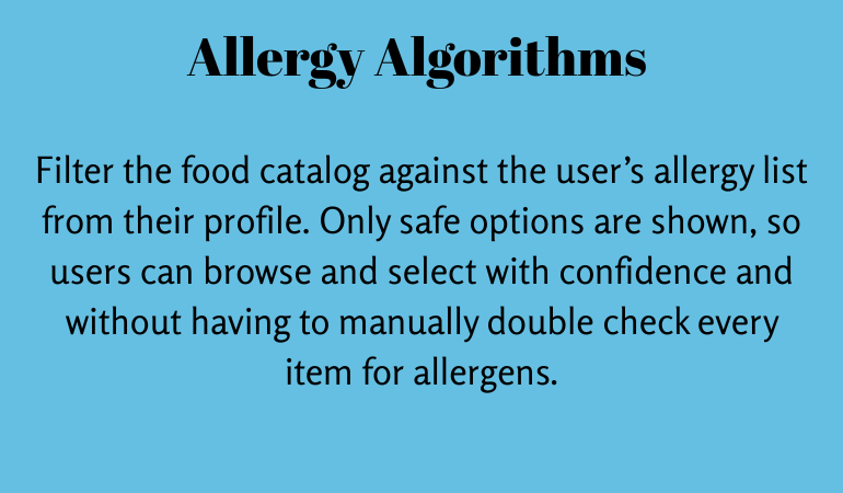
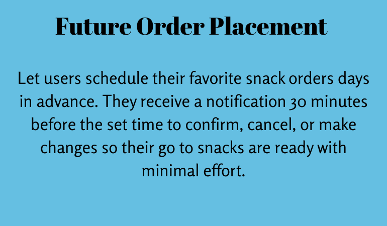
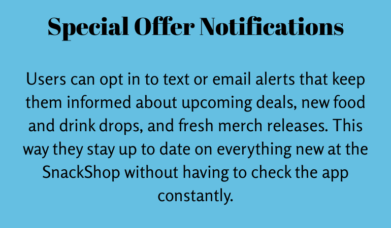
Ideas to build on
Some of the future ideas that would make this website even better.
Insights Gained
Designing MuseFinder was especially meaningful because I am an avid museum enthusiast. My personal experiences helped me recognize common challenges users face when searching for museums and accessing important information, which inspired me to create a solution that makes discovering museums simple, accessible, and efficient.
Throughout the project, I learned that simplicity can have the greatest impact. While there are additional features I would love to explore in future iterations, I chose to prioritize a clean, intuitive experience that helps users find what they need without feeling overwhelmed. This project reinforced the importance of balancing functionality with usability, ensuring that every design decision supports a seamless and enjoyable user experience.
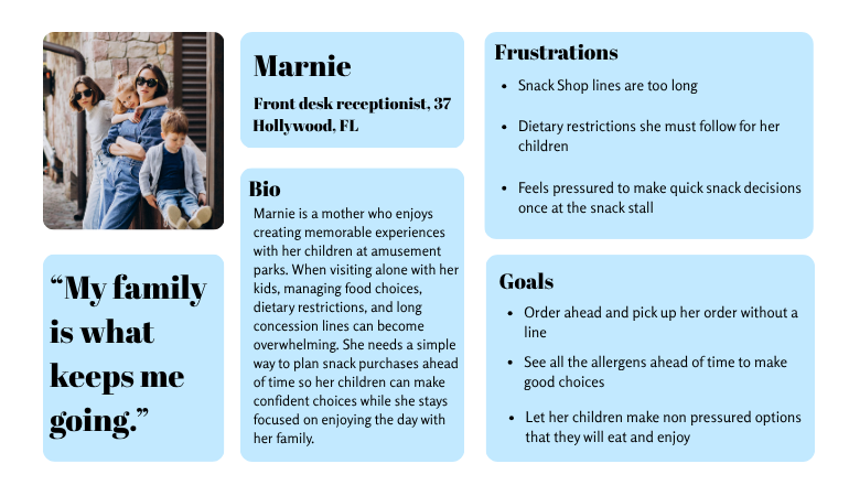
Persona # 1: The parent:
Parents visiting amusement parks often balance multiple responsibilities while trying to create an enjoyable experience for their children. Many are navigating the park on their own, making it difficult to manage long concession lines while also supervising their kids. They need a convenient way to order food that reduces stress and helps keep the day running smoothly.
Children may take extra time to choose what they want or have dietary preferences and food allergies that require careful consideration. By allowing families to browse menus and place orders before reaching the counter, parents can help their children make thoughtful decisions without the pressure of a long line, creating a more relaxed experience for both the family and concession staff.
Persona # 2: The independent guest with mobility issues:
Many theme park guests with mobility challenges still want to enjoy attractions, entertainment, and memorable experiences independently. They often plan their visits around accessibility features, rest opportunities, and the amount of walking or standing required throughout the day.
For guests who have difficulty standing for extended periods, long food lines can become a major barrier to enjoying the park. Waiting for snacks or meals may require more physical effort than expected and can interrupt their experience or even force them to leave earlier than planned.
These visitors benefit from solutions that reduce unnecessary waiting, provide convenient access to food and services, and allow them to maintain their independence while exploring the park at their own pace.
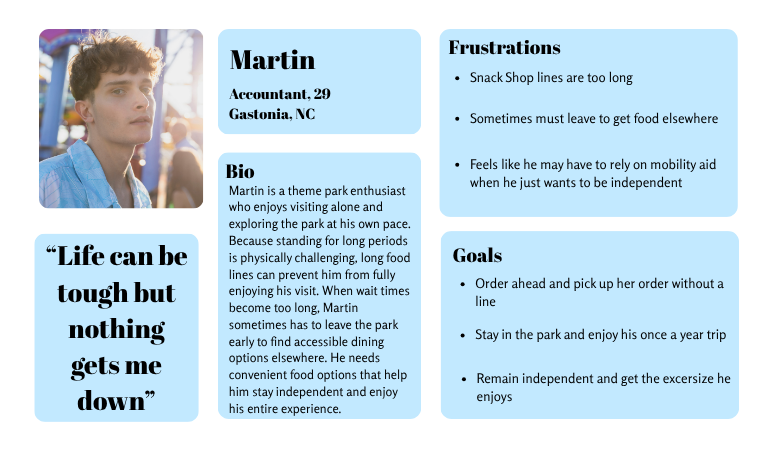
Both people may have different frustrations and goals but what is consistent is the need to order ahead to skip the long lines.
Ideation Process
How can I make the process simple to use and easy for people to navigate? Will people want a way to track past snacks?
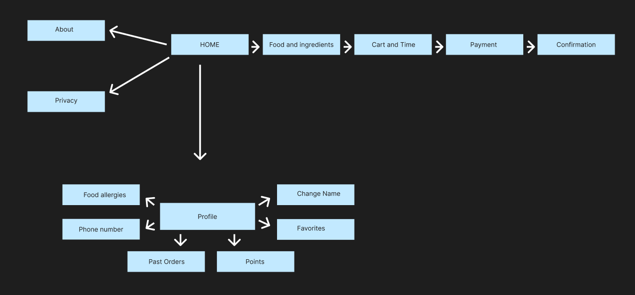
Sitemap showing simple and easy navigation.
Foundation
Side by side of both wireframe and mock up of the SnackShop Homepage.
I chose these 4 colors due to being light and fun. When I looked at these colors I instantly thought about theme parks.
When coming up with a name for SnackShop I wanted things to be simple and easily understood. Since it is all things snacks it just made the most since.
Final Prototype
Want to do your own exploring? Check out the prototype Here.Ideas to build on
Some of the future ideas that would make this website even better.
Insights Gained
Designing MuseFinder was especially meaningful because I am an avid museum enthusiast. My personal experiences helped me recognize common challenges users face when searching for museums and accessing important information, which inspired me to create a solution that makes discovering museums simple, accessible, and efficient.
Throughout the project, I learned that simplicity can have the greatest impact. While there are additional features I would love to explore in future iterations, I chose to prioritize a clean, intuitive experience that helps users find what they need without feeling overwhelmed. This project reinforced the importance of balancing functionality with usability, ensuring that every design decision supports a seamless and enjoyable user experience.
Persona # 1: The parent:
Parents visiting amusement parks often balance multiple responsibilities while trying to create an enjoyable experience for their children. Many are navigating the park on their own, making it difficult to manage long concession lines while also supervising their kids. They need a convenient way to order food that reduces stress and helps keep the day running smoothly.
Children may take extra time to choose what they want or have dietary preferences and food allergies that require careful consideration. By allowing families to browse menus and place orders before reaching the counter, parents can help their children make thoughtful decisions without the pressure of a long line, creating a more relaxed experience for both the family and concession staff.
Persona # 2: The independent guest with mobility issues:
Many theme park guests with mobility challenges still want to enjoy attractions, entertainment, and memorable experiences independently. They often plan their visits around accessibility features, rest opportunities, and the amount of walking or standing required throughout the day.
For guests who have difficulty standing for extended periods, long food lines can become a major barrier to enjoying the park. Waiting for snacks or meals may require more physical effort than expected and can interrupt their experience or even force them to leave earlier than planned.
These visitors benefit from solutions that reduce unnecessary waiting, provide convenient access to food and services, and allow them to maintain their independence while exploring the park at their own pace.
Both people may have different frustrations and goals but what is consistent is the need to order ahead to skip the long lines.
Ideation Process
How can I make the process simple to use and easy for people to navigate? Will people want a way to track past snacks?
Sitemap showing simple and easy navigation.
Foundation
Side by side of both wireframe and mock up of the SnackShop Homepage.
I chose these 4 colors due to being light and fun. When I looked at these colors I instantly thought about theme parks.
When coming up with a name for SnackShop I wanted things to be simple and easily understood. Since it is all things snacks it just made the most since.
Final Prototype
Want to do your own exploring? Check out the prototype Here.Ideas to build on
Some of the future ideas that would make this website even better.
Insights Gained
Designing MuseFinder was especially meaningful because I am an avid museum enthusiast. My personal experiences helped me recognize common challenges users face when searching for museums and accessing important information, which inspired me to create a solution that makes discovering museums simple, accessible, and efficient.
Throughout the project, I learned that simplicity can have the greatest impact. While there are additional features I would love to explore in future iterations, I chose to prioritize a clean, intuitive experience that helps users find what they need without feeling overwhelmed. This project reinforced the importance of balancing functionality with usability, ensuring that every design decision supports a seamless and enjoyable user experience.
Persona # 1: The parent:
Parents visiting amusement parks often balance multiple responsibilities while trying to create an enjoyable experience for their children. Many are navigating the park on their own, making it difficult to manage long concession lines while also supervising their kids. They need a convenient way to order food that reduces stress and helps keep the day running smoothly.
Children may take extra time to choose what they want or have dietary preferences and food allergies that require careful consideration. By allowing families to browse menus and place orders before reaching the counter, parents can help their children make thoughtful decisions without the pressure of a long line, creating a more relaxed experience for both the family and concession staff.
Persona # 2: The independent guest with mobility issues:
Many theme park guests with mobility challenges still want to enjoy attractions, entertainment, and memorable experiences independently. They often plan their visits around accessibility features, rest opportunities, and the amount of walking or standing required throughout the day.
For guests who have difficulty standing for extended periods, long food lines can become a major barrier to enjoying the park. Waiting for snacks or meals may require more physical effort than expected and can interrupt their experience or even force them to leave earlier than planned.
These visitors benefit from solutions that reduce unnecessary waiting, provide convenient access to food and services, and allow them to maintain their independence while exploring the park at their own pace.
Both people may have different frustrations and goals but what is consistent is the need to order ahead to skip the long lines.
Ideation Process
How can I make the process simple to use and easy for people to navigate? Will people want a way to track past snacks?
Sitemap showing simple and easy navigation.
Foundation
Side by side of both wireframe and mock up of the SnackShop Homepage.
I chose these 4 colors due to being light and fun. When I looked at these colors I instantly thought about theme parks.
When coming up with a name for SnackShop I wanted things to be simple and easily understood. Since it is all things snacks it just made the most since.
Final Prototype
Want to do your own exploring? Check out the prototype Here.Ideas to build on
Some of the future ideas that would make this website even better.
Insights Gained
Designing MuseFinder was especially meaningful because I am an avid museum enthusiast. My personal experiences helped me recognize common challenges users face when searching for museums and accessing important information, which inspired me to create a solution that makes discovering museums simple, accessible, and efficient.
Throughout the project, I learned that simplicity can have the greatest impact. While there are additional features I would love to explore in future iterations, I chose to prioritize a clean, intuitive experience that helps users find what they need without feeling overwhelmed. This project reinforced the importance of balancing functionality with usability, ensuring that every design decision supports a seamless and enjoyable user experience.